

Services

UI UX Design

Web Design
MVP Design
SaaS Design
Branding
UX Audit
Landing Page
Design System
Framer
UX Research
Work
About
Blog
Pricing
Design Subscription
Let’s talk

ParcelDaily
Web Design For A Courier Delivery Platform
Web Design • SaaS Design
A Malaysian logistics platform for e-commerce, offering integrated courier services for shipping, with features like competitive rates, free pickup, COD remittance, real-time tracking, and warehouse solutions to simplify logistics.

Industry
Logistics

Headquarters
Selangor, Malaysia
Company size
11-50 employees
Services
• Dashboard UI UX design
• SaaS website design
• UX research & flow optimization
Website

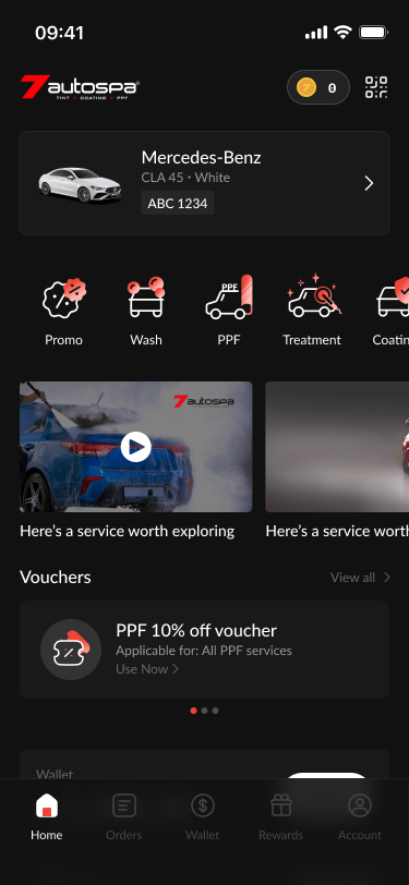
Problem
Since 2023, 7Autospa has been using an app that has an outdated design, no clear user journey and inconvenient navigations. Also a lack of useful features that has lead the app to have low onboarding rate and conversion rate.
PROBLEM #1
Unclear Journey
The user experience in the home page unclear and has no clear call-to-action. There’s also unnecessary sections that are huge and covers a large proportion of the screen.
EXAMPLE
The app constantly have a black bar on the top section that shows no relevant information or functionality. Also the advertisement section to large and takes up too much vertical space.
IMPACT
With no clear action for the user to do, with so much wasted space, the user would need to constantly scroll through and navigate the app to understand what they could do.
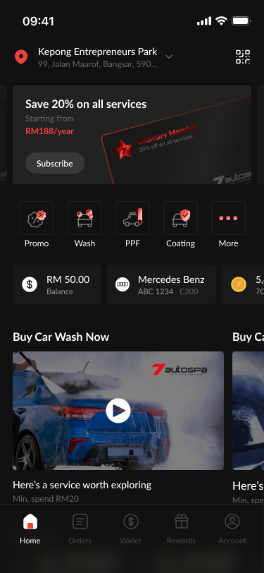
PROBLEM #2
Inconvenient Navigation
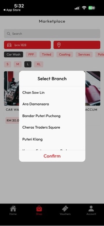
Whenever a user would like to purchase an item or service, they would need to always go through a difficult process. And they could only see a limited number of services provided.
EXAMPLE
When browsing at the shop page, the user needs to select the branch they wish to shop at every time. And after selecting it, it doesn’t save the selected branch. And browsing the categories are confusing and very limited.
IMPACT
The inconvenience of selecting the branch each time will drop conversions severely as it makes users consume more time and higher frustrations during checkout.
PROBLEM #3
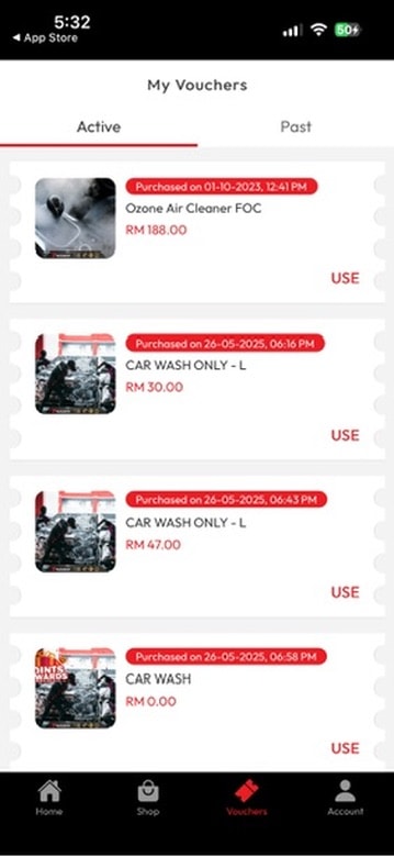
Confusing Purchase History
The users purchases called “My Vouchers” are laid out in a very minimal way but does not show relevant information to help users decide which is the best on to use.
EXAMPLE
The vouchers here do not show the branch purchased from and again takes up a lot of vertical space.
IMPACT
The lack of clear information to help users know which voucher to use will inconvenient users, they would need to select each voucher to check which branch it is for before using.
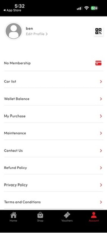
PROBLEM #4
Lack of Design Styles
The Account page is the central hub for user management, but the legacy design featured a fragmented list that buried high-value actions like top-ups and rewards.
EXAMPLE
Users checking their Wallet Balance or Maintenance history must scan a long list of text. Without icons or groupings, they read every line, slowing navigation.
IMPACT
Reduced retention when Rewards and Vouchers are hidden in a list, users feel less incentivized to return to the app.
Defining the problem

How might we redesign a better experience for users to browse and purhcase car detailing services?
Goals
BUSINESS GOALS
Drive High-Value Conversions and Retention
The redesign aims to transform the app from a basic utility into a premium ecosystem. By introducing a prominent membership status banner and a clear "Upgrade" call-to-action (CTA), we aim to increase premium subscription rates and customer lifetime value.
Optimize Transactional Velocity
To improve the business's cash flow, the new interface prioritizes high-frequency actions like "Top Up" and "Voucher" management. By moving these from hidden text lists to a primary icon grid, we reduce the friction required for users to add funds and complete purchases.
USER GOALS
Seamless Service Discovery
The primary goal is to eliminate the "Unclear Journey" found in the legacy design. By refining the visual hierarchy and removing unnecessary sections that occupy excessive screen space, users can find relevant automotive services and deals without exhaustive scrolling.
Reduced Cognitive Load and Friction
Navigating the app should feel effortless. We aim to solve "Inconvenient Navigation" by streamlining the branch selection process and organizing the Account page into logical groupings. This ensures that essential data, like wallet balances and car maintenance history is visible at a glance, minimizing the time spent on administrative tasks.
Impact
As this is a huge project, we released the new designs in phases. For confidentiality reasons I have omitted the actual values for these metrics.
28%
Boosting Membership Conversions
+35%
Top Up frequency
+22%
Voucher redemption rate
+15%
Average Order Value

24%
Improvement in Booking Speed. With our new feature to remind users to purchase a car wash service based on the closest location.
22%
Increase in service add-ons at checkout enhances upselling. The new screen displays car wash options, making purchases persuasive.
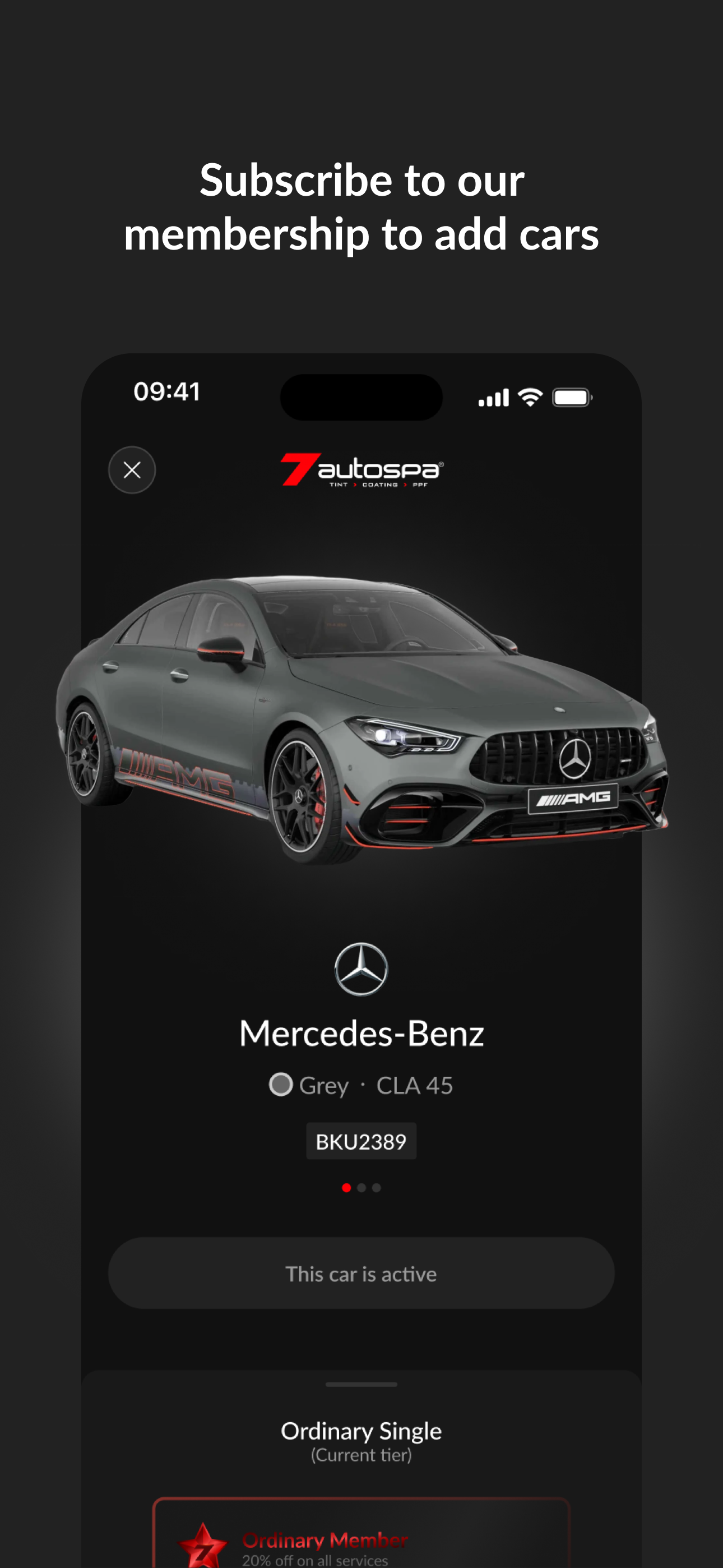
60%
Increase in user engagement with the new My Cars page with a high-fidelity 3D car render creates a more personalized and premium ownership feel. This encourages users to register multiple vehicles and track specific maintenance for each.
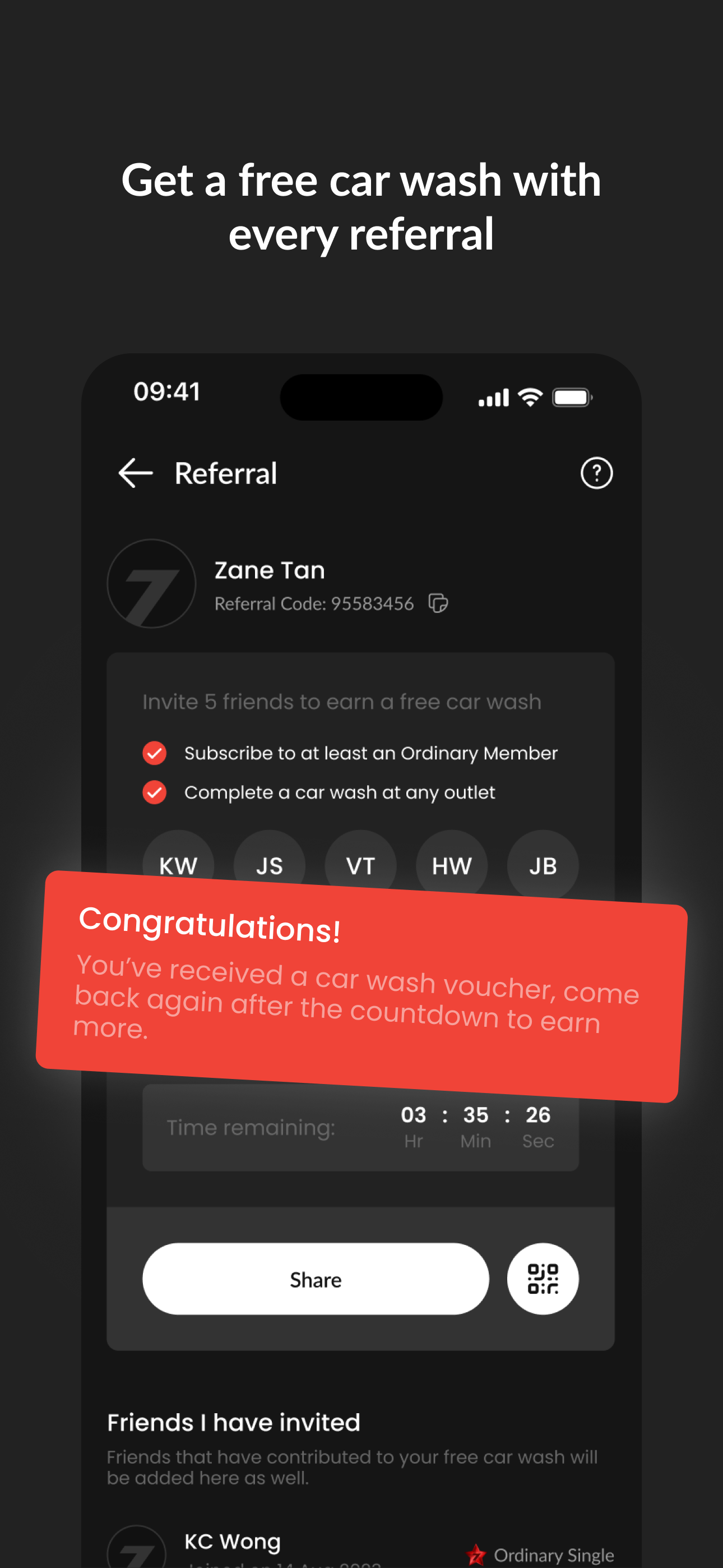
100%
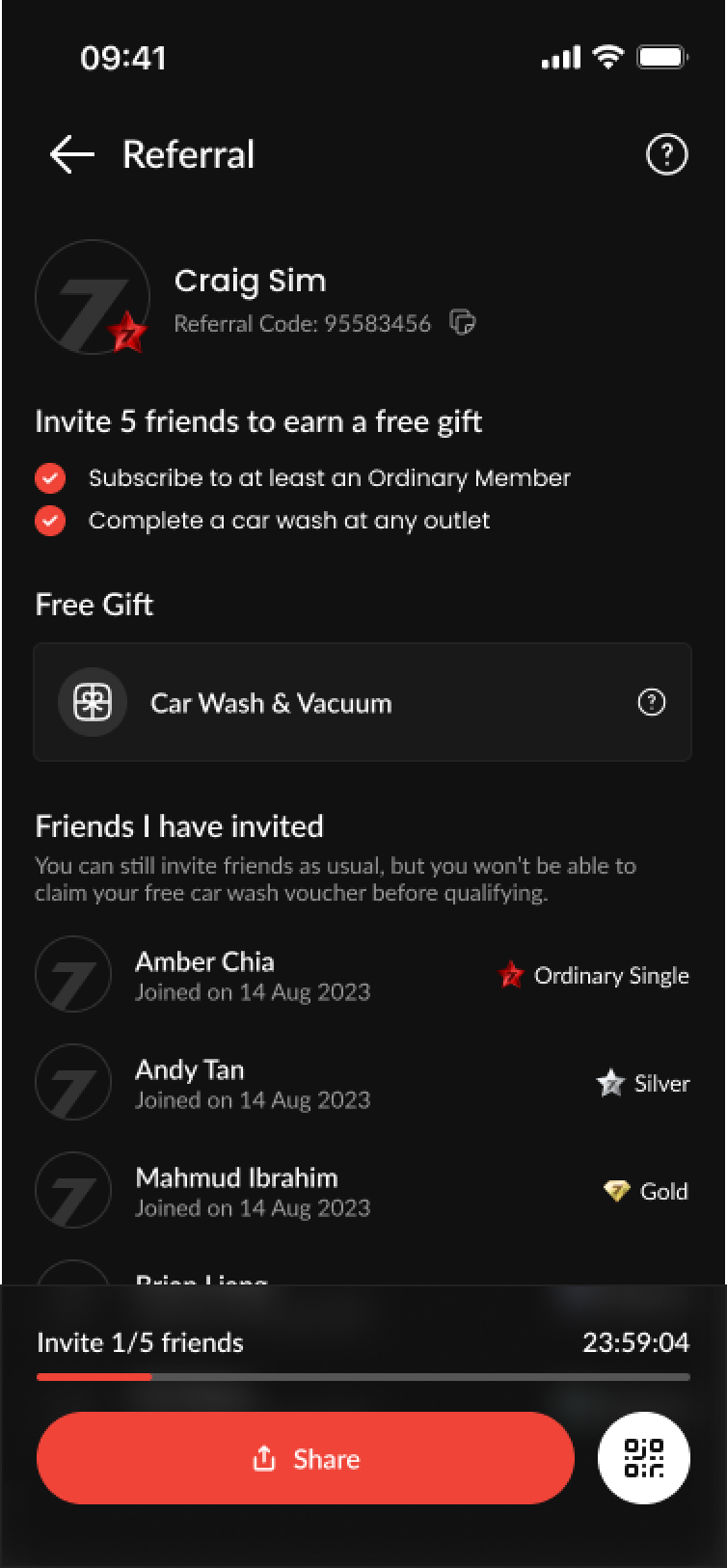
Referral Program Growth. The Tew screen visualizes rewards and includes a progress bar, making goals feel achievable.
Our users
Before we started designing, we deep-dived into existing behavioral and purchase data to understand our car owners better. We focused on identifying the "Jobs-to-be-Done" that drive users to seek professional auto-care.
We defined 3 user archetypes that represent the core of the 7Autospa ecosystem:
The Busy Professional
An urban commuter who views their car as an extension of their professional image. They value speed and automation above all else.
HOW THEY USE THE APP
When I am heading to an important meeting, I want to be able to quickly book a car wash and pay via the aoo so I can arrive in a clean car without waiting in a long queue.
The Detailing Enthusiast
A car person who treats their vehicle as a high-value asset. They are less price-sensitive but highly focused on quality, protection (PPF/Coating), and service history.
HOW THEY USE THE APP
When I invest in a new vehicle, I want to track its maintenance history and easily access premium detailing services so I can maintain the car's resale value and aesthetic.
The Family Value-Seeker
A pragmatic user who manages multiple vehicles. They are motivated by long-term savings and membership perks like free gifts and wallet credits.
HOW THEY USE THE APP
When I need to maintain the family cars, I want to see my membership benefits and active vouchers at a glance so I can keep our vehicles clean while staying within my monthly household budget.
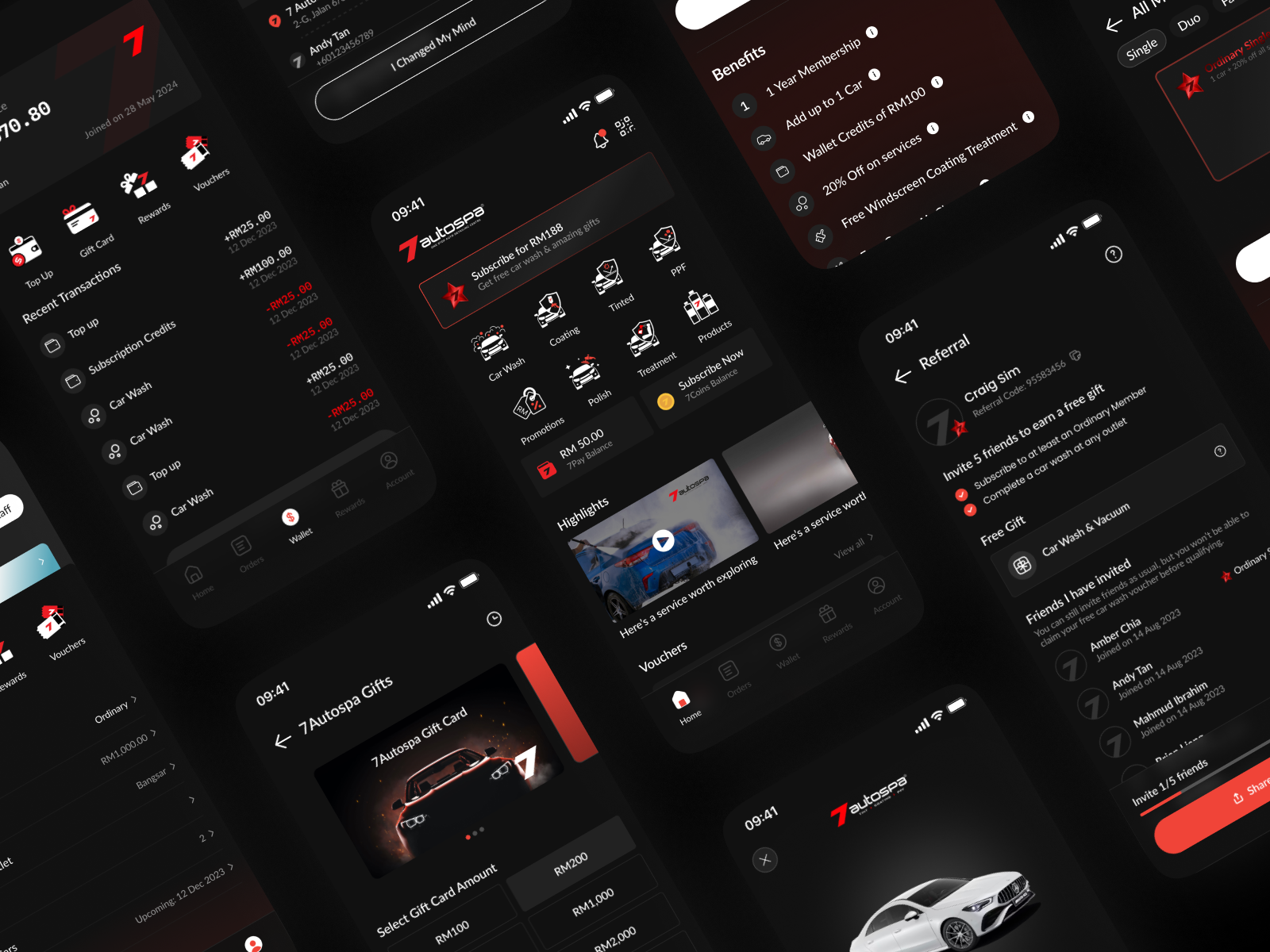
Early Design Variations
Design is rarely a linear path. These early variations represent a rigorous process of trial and refinement, with each core screen undergoing over 30 iterations. This high volume of exploration was driven by a commitment to user-centricity and the need to adapt to external complexities.
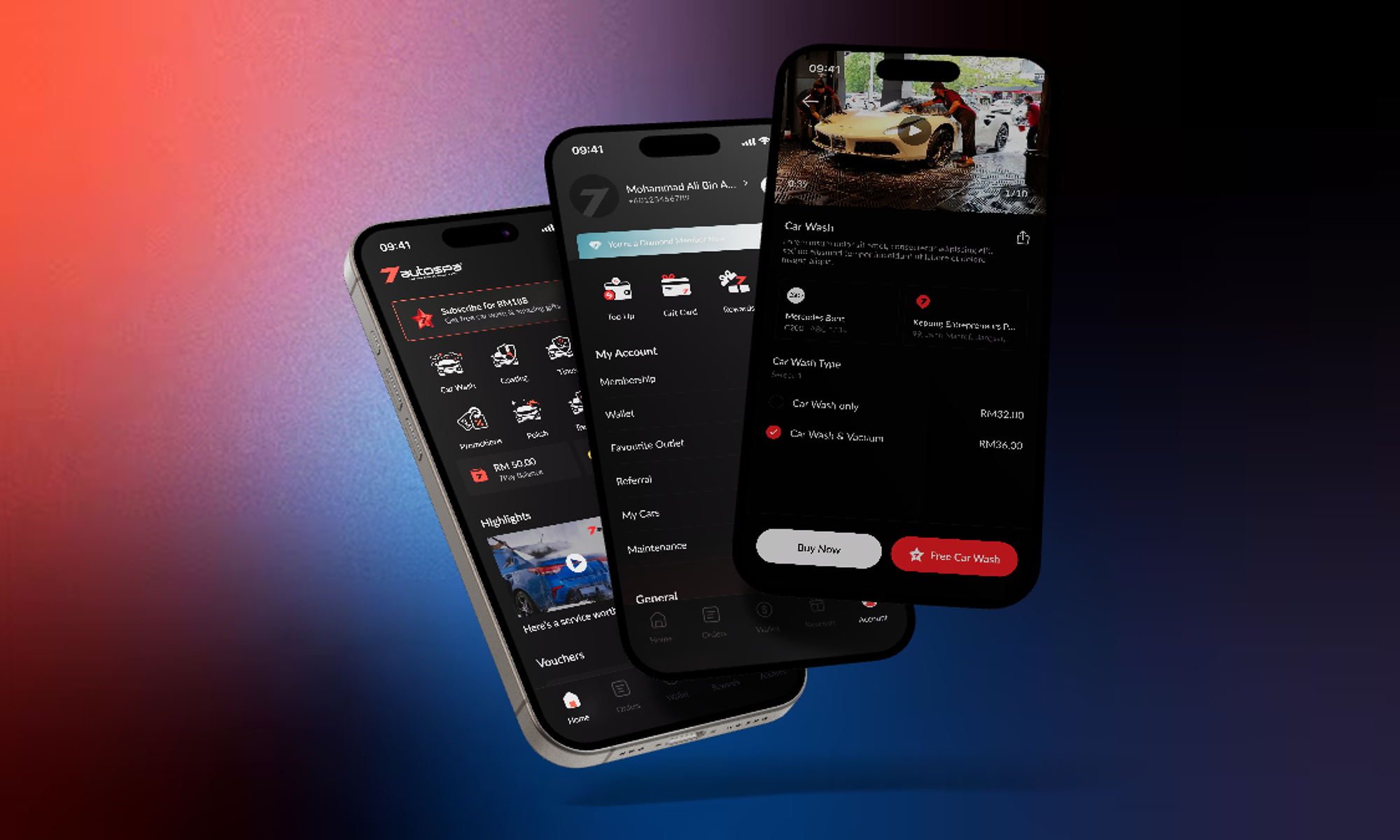
Final Designs
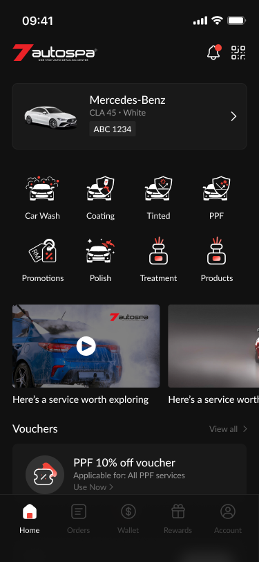
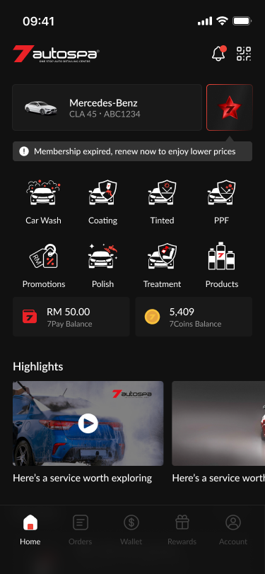
Before the redesign, the 7Autospa digital experience suffered from a lack of strategic focus. The interface functioned merely as a basic utility, a digital list of services that failed to capture the premium nature of the brand. Key features were buried, and the user journey felt stagnant, offering little incentive for users to explore beyond a single transaction. The absence of a cohesive design system meant that the app lacked the "personality" and high-end feel that 7Autospa customers expect from their physical service centers.
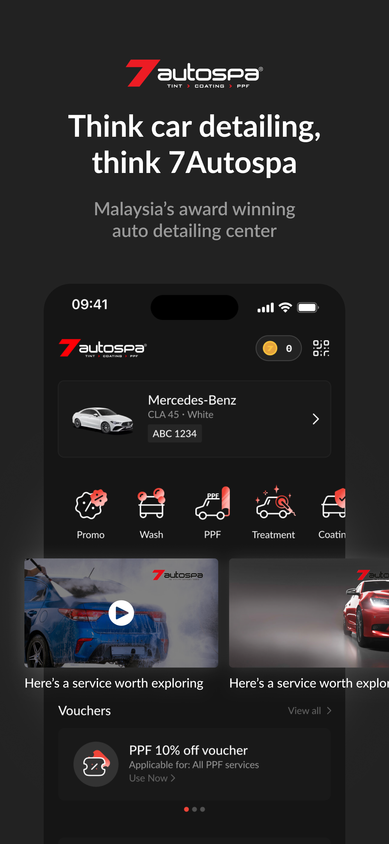
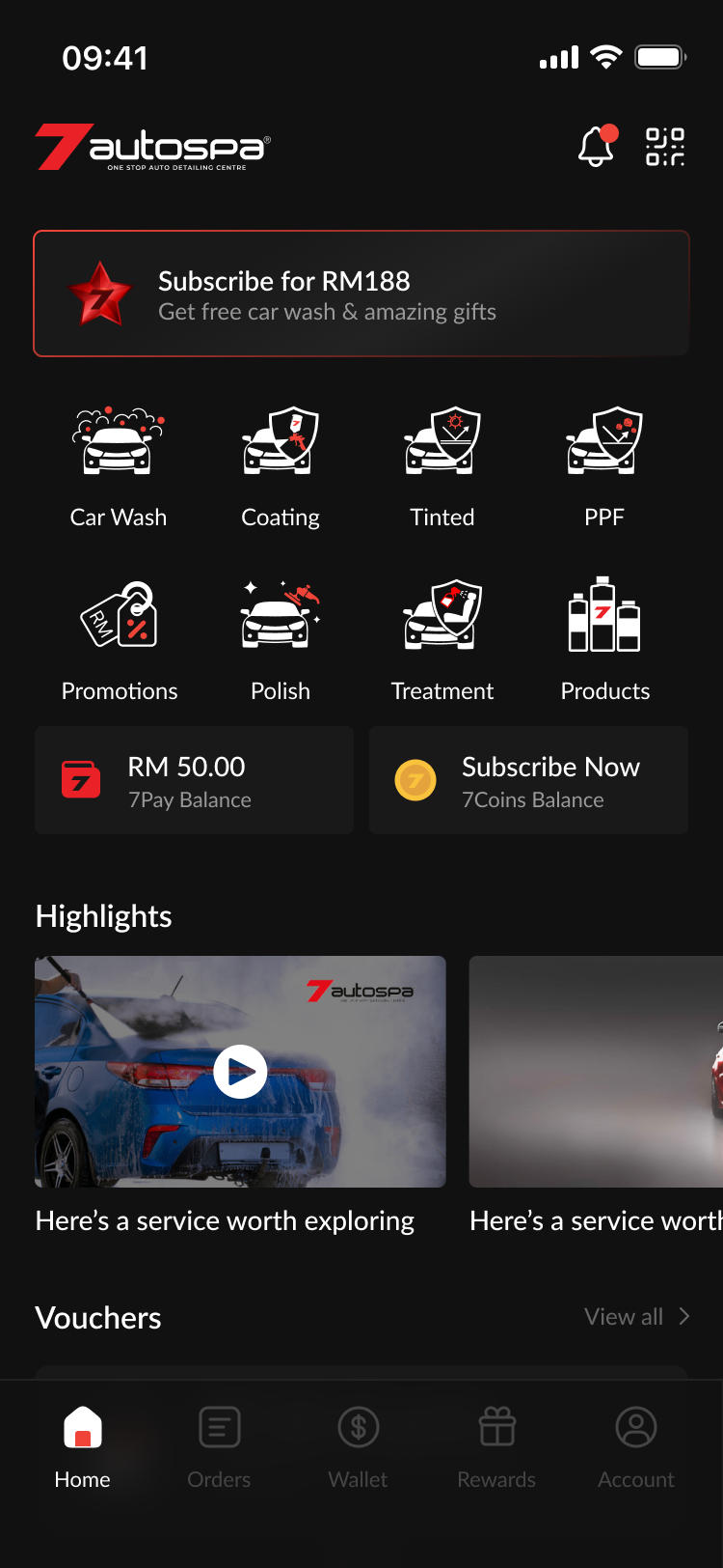
Home Page
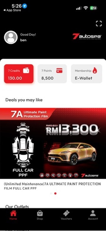
The 7Autospa home page was redesigned from a basic utility list into a premium, personalized dashboard that reflects the brand's high-end identity. We optimized the layout by reclaiming wasted header space for notifications, replacing oversized ads with a streamlined service icon grid, and introducing a "My Car" widget for a tailored user experience. Crucially, the update resolves previous navigation dead-ends by integrating a dynamic membership status bar and services list, ensuring a frictionless and high-personality journey for every customer.
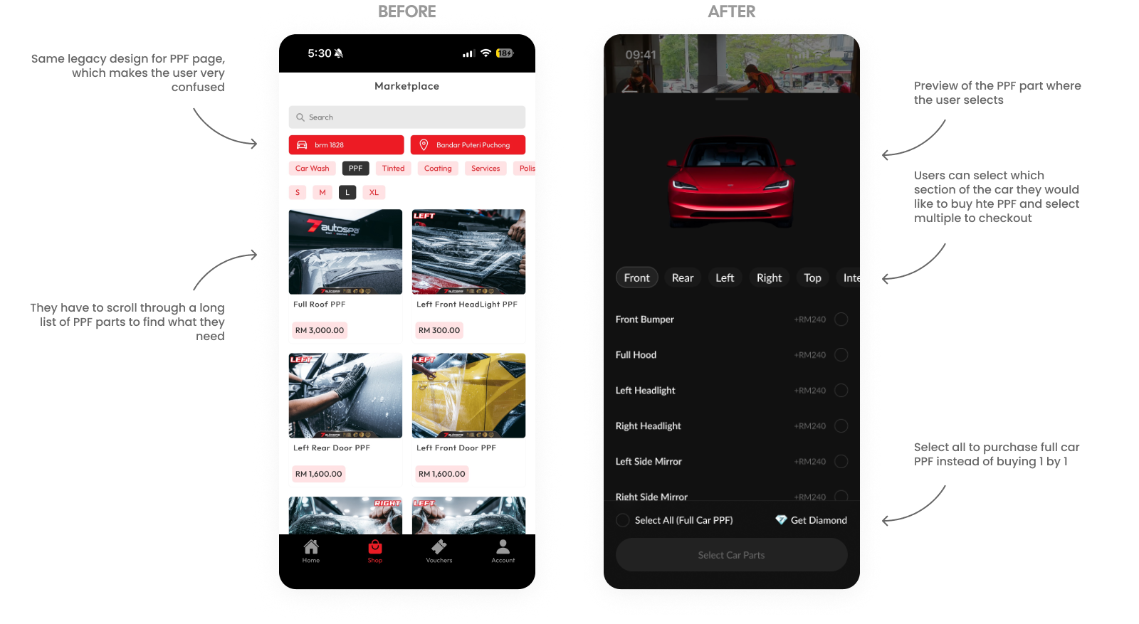
PPF Booking
The PPF booking page was redesigned to replace a confusing legacy list with a highly visual, interactive selection interface. To eliminate the need to scroll through long lists of individual parts, we introduced a 3D-style car preview that dynamically updates as users select specific sections for protection. This new flow allows users to multi-select various car segments for a custom checkout or use a single "Select All" toggle to purchase a full-car PPF package instantly, significantly streamlining the decision-making process.
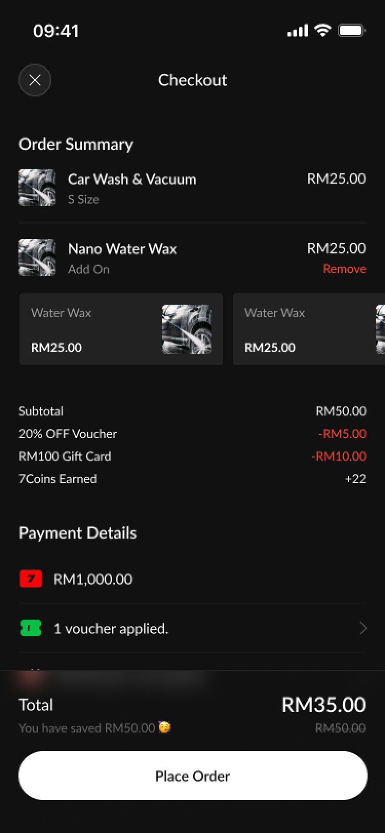
Using Service
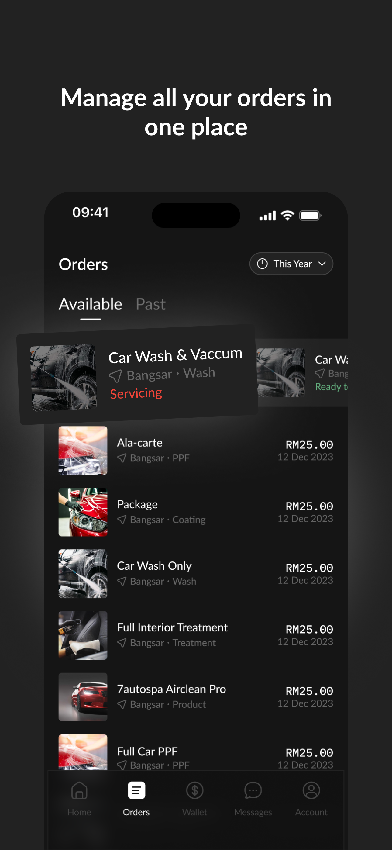
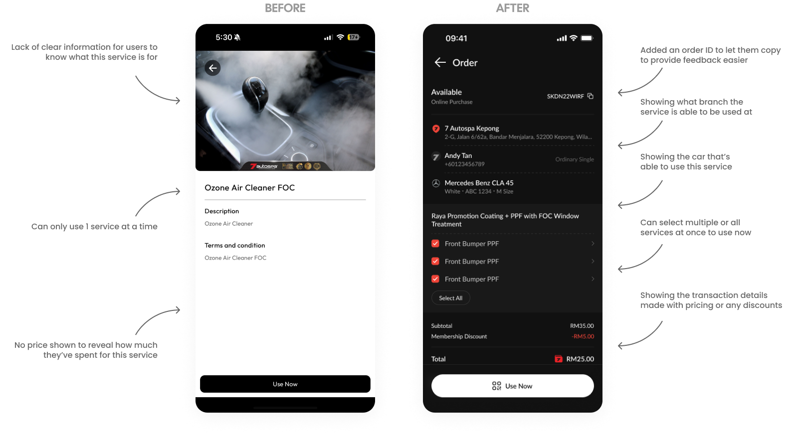
The redesigned services page transforms a vague interface into a comprehensive command center. We added an Order ID, branch location, and vehicle details to improve transparency and support. Most significantly, the update replaces the one-at-a-time restriction with a multi-select system for simultaneous service redemption, complete with a clear pricing and discount breakdown.
Wallet Page
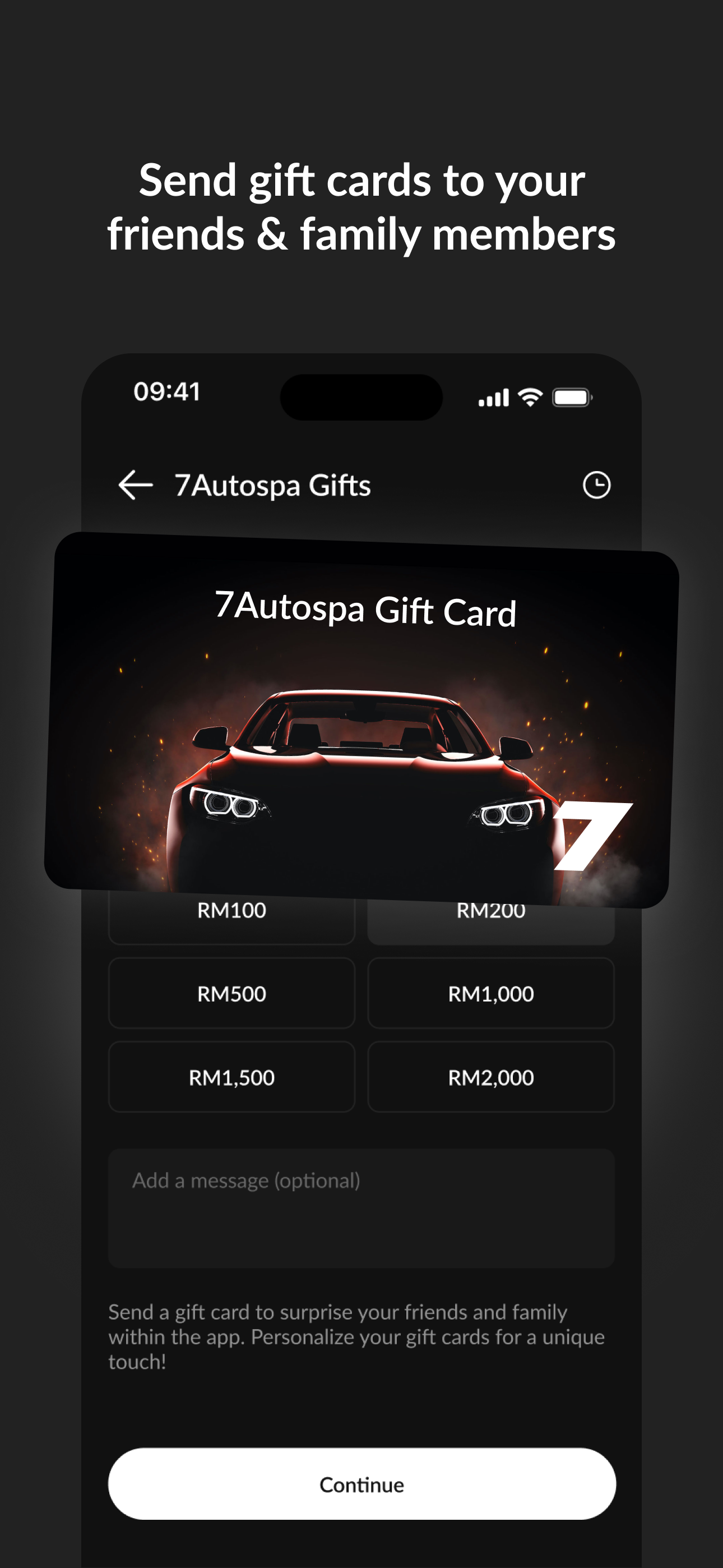
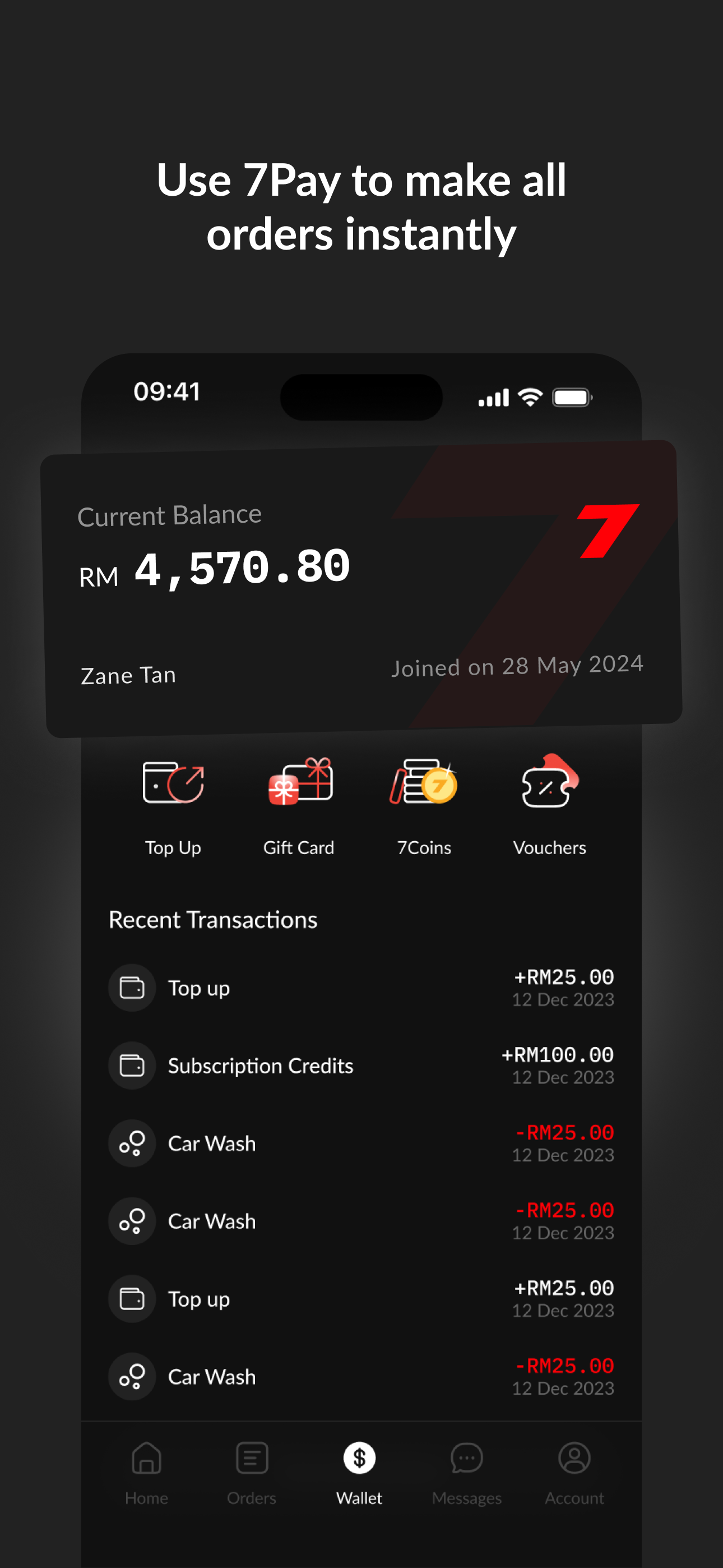
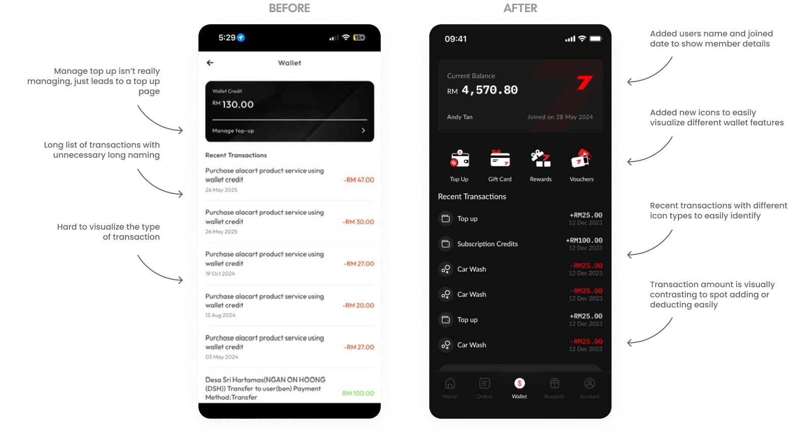
The Wallet page was redesigned to transform a text-heavy transaction list into a high-utility financial dashboard. We replaced the vague "Manage Top-up" link with a branded digital card featuring member details and introduced a dedicated icon row for quick access to Top Up, Gift Cards, and Rewards. To enhance scannability, we streamlined transaction names, added identifying icons, and used high-contrast colors to differentiate credits from deductions at a glance.
Top Up Page
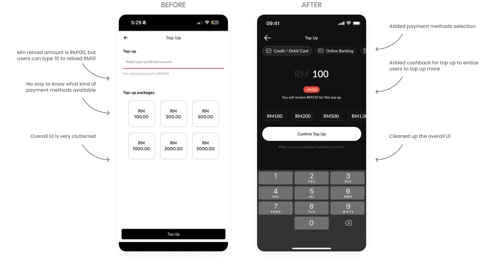
The Top Up page redesign replaces a cluttered, confusing layout with a focused UI that prioritizes speed and user incentives. We introduced visible payment method selections and a dynamic cashback indicator to encourage higher transaction values. By streamlining the amount selection and clarifying reload requirements, the new interface eliminates friction and delivers a more modern, intuitive payment experience.
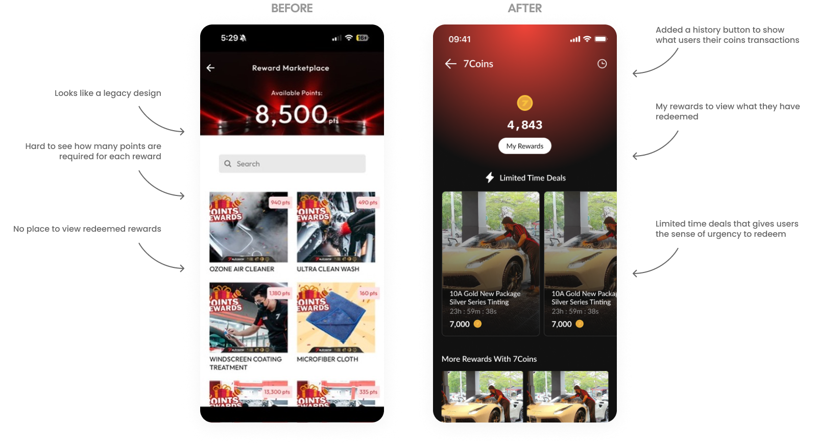
7Coins Page (Rewards)
The 7Coins Rewards page was modernized to replace a legacy aesthetic with a more urgent, user-centric interface. We introduced a dedicated history button for point tracking and a "My Rewards" section to allow users to easily view their redeemed items. To improve motivation, the redesign features prominent "Limited Time Deals" that create a sense of urgency, along with much clearer point requirements for each reward compared to the previous cluttered view.
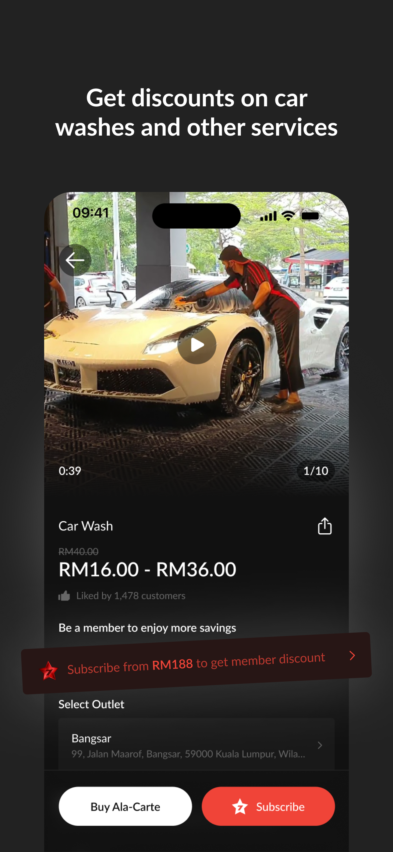
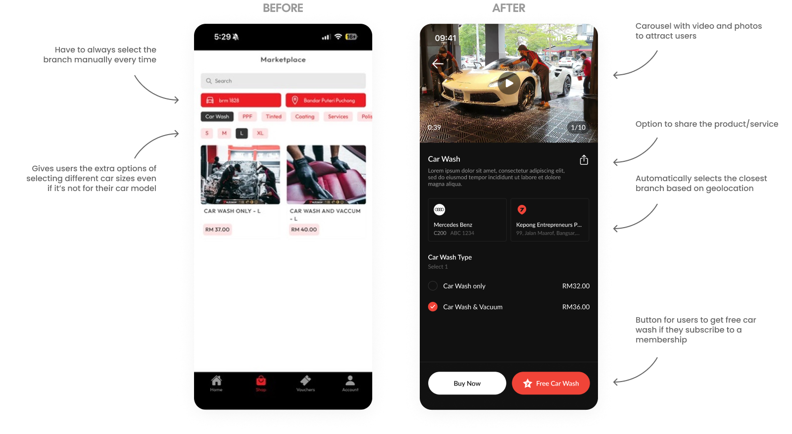
Car Wash / General Services
The car wash booking flow was redesigned to replace a manual, high-friction process with an automated and visually immersive experience. We implemented a video carousel for better service visualization and geolocation to automatically select the nearest branch. By syncing with the user's pre-registered vehicle to remove redundant size selections and adding a "Free Car Wash" incentive, the new flow significantly reduces friction while driving membership conversions.

Mashify is a global UI UX design agency that boosts brand value with user-friendly designs for web, mobile & SaaS.
Pitch Deck

Services
UI UX design
Web design
MVP design
SaaS design
Branding
UX audit
Landing page
Design system
Framer
UX research
Case Studies
ParcelDaily
7Autospa
TwoMono
View all work
Contact
Clutch
Behance
Dribbble
Our contacts


Mash Technologies © 2025
Based in
🇲🇾


Services


UI UX Design
Designing intuitive interfaces and smooth experiences.

Web Design
Creating websites that turn visitors into loyal customers.

MVP Design
Stop guessing, we test and gather feedback to meet demand.

SaaS Design
Optimizing software for max user retention and growth.

Branding
Defining your unique visual identity to stand out globally.

UX Audit
Identifying and fixing friction points to polish your UX.

Landing Page
Designing result & speed focused, high-impact pages.

Design System
A single source of truth helps your product scale.

Framer
Launching fast, interactive, and beautifully animated websites.

UX Research
Deep-diving into user data to validate
ideas.
Design Subscription
One subscription, unlimited design requests for your business.
Subscribe

Work
About
Blog
Pricing
Design Subscription
Let’s talk

ParcelDaily
Web Design For A Courier Delivery Platform
Web Design • SaaS Design
A Malaysian logistics platform for e-commerce, offering integrated courier services for shipping, with features like competitive rates, free pickup, COD remittance, real-time tracking, and warehouse solutions to simplify logistics.
Problem
Since 2023, 7Autospa has been using an app that has an outdated design, no clear user journey and inconvenient navigations. Also a lack of useful features that has lead the app to have low onboarding rate and conversion rate.
PROBLEM #1
Unclear Journey
The user experience in the home page unclear and has no clear call-to-action. There’s also unnecessary sections that are huge and covers a large proportion of the screen.
EXAMPLE
The app constantly have a black bar on the top section that shows no relevant information or functionality. Also the advertisement section to large and takes up too much vertical space.
IMPACT
With no clear action for the user to do, with so much wasted space, the user would need to constantly scroll through and navigate the app to understand what they could do.
PROBLEM #2
Inconvenient Navigation
Whenever a user would like to purchase an item or service, they would need to always go through a difficult process. And they could only see a limited number of services provided.
EXAMPLE
When browsing at the shop page, the user needs to select the branch they wish to shop at every time. And after selecting it, it doesn’t save the selected branch. And browsing the categories are confusing and very limited.
IMPACT
The inconvenience of selecting the branch each time will drop conversions severely as it makes users consume more time and higher frustrations during checkout.
PROBLEM #3
Confusing Purchase History
The users purchases called “My Vouchers” are laid out in a very minimal way but does not show relevant information to help users decide which is the best on to use.
EXAMPLE
The vouchers here do not show the branch purchased from and again takes up a lot of vertical space.
IMPACT
The lack of clear information to help users know which voucher to use will inconvenient users, they would need to select each voucher to check which branch it is for before using.
PROBLEM #4
Lack of Design Styles
The Account page is the central hub for user management, but the legacy design featured a fragmented list that buried high-value actions like top-ups and rewards.
EXAMPLE
Users checking their Wallet Balance or Maintenance history must scan a long list of text. Without icons or groupings, they read every line, slowing navigation.
IMPACT
Reduced retention when Rewards and Vouchers are hidden in a list, users feel less incentivized to return to the app.
Defining the problem
How might we redesign a better experience for users to browse and purhcase car detailing services?
Goals
BUSINESS GOALS
Drive High-Value Conversions and Retention
The redesign aims to transform the app from a basic utility into a premium ecosystem. By introducing a prominent membership status banner and a clear "Upgrade" call-to-action (CTA), we aim to increase premium subscription rates and customer lifetime value.
Optimize Transactional Velocity
To improve the business's cash flow, the new interface prioritizes high-frequency actions like "Top Up" and "Voucher" management. By moving these from hidden text lists to a primary icon grid, we reduce the friction required for users to add funds and complete purchases.
USER GOALS
Seamless Service Discovery
The primary goal is to eliminate the "Unclear Journey" found in the legacy design. By refining the visual hierarchy and removing unnecessary sections that occupy excessive screen space, users can find relevant automotive services and deals without exhaustive scrolling.
Reduced Cognitive Load and Friction
Navigating the app should feel effortless. We aim to solve "Inconvenient Navigation" by streamlining the branch selection process and organizing the Account page into logical groupings. This ensures that essential data, like wallet balances and car maintenance history is visible at a glance, minimizing the time spent on administrative tasks.
Impact
As this is a huge project, we released the new designs in phases. For confidentiality reasons I have omitted the actual values for these metrics.
28%
Boosting Membership Conversions
+35%
Top Up frequency
+22%
Voucher redemption rate
+15%
Average Order Value
24%
Improvement in Booking Speed. With our new feature to remind users to purchase a car wash service based on the closest location.
22%
Increase in service add-ons at checkout enhances upselling. The new screen displays car wash options, making purchases persuasive.
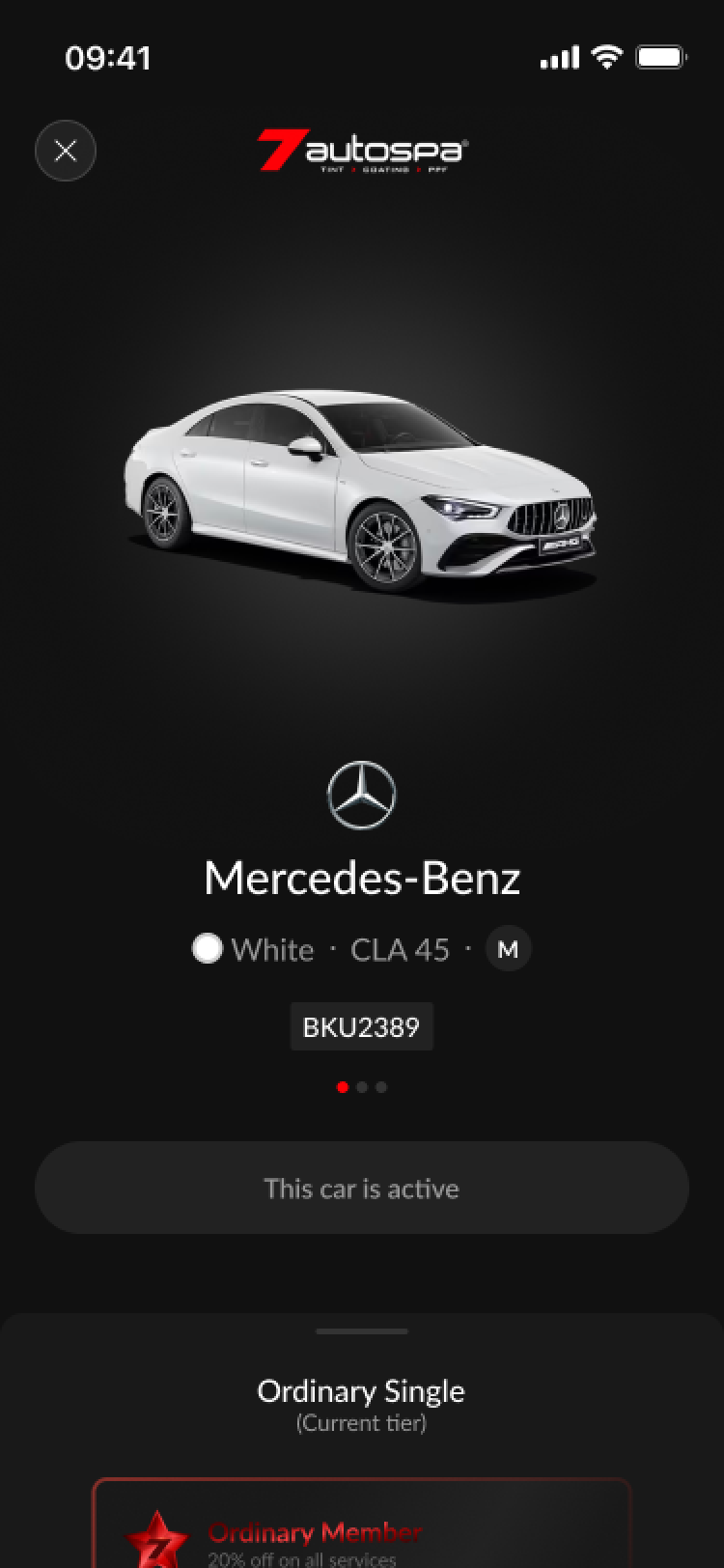
60%
Increase in user engagement with the new My Cars page with a high-fidelity 3D car render creates a more personalized and premium ownership feel. This encourages users to register multiple vehicles and track specific maintenance for each.
100%
Referral Program Growth. The Tew screen visualizes rewards and includes a progress bar, making goals feel achievable.
Our users
Before we started designing, we deep-dived into existing behavioral and purchase data to understand our car owners better. We focused on identifying the "Jobs-to-be-Done" that drive users to seek professional auto-care.
We defined 3 user archetypes that represent the core of the 7Autospa ecosystem:
The Busy Professional
An urban commuter who views their car as an extension of their professional image. They value speed and automation above all else.
HOW THEY USE THE APP
When I am heading to an important meeting, I want to be able to quickly book a car wash and pay via the aoo so I can arrive in a clean car without waiting in a long queue.
The Detailing Enthusiast
A car person who treats their vehicle as a high-value asset. They are less price-sensitive but highly focused on quality, protection (PPF/Coating), and service history.
HOW THEY USE THE APP
When I invest in a new vehicle, I want to track its maintenance history and easily access premium detailing services so I can maintain the car's resale value and aesthetic.
The Family Value-Seeker
A pragmatic user who manages multiple vehicles. They are motivated by long-term savings and membership perks like free gifts and wallet credits.
HOW THEY USE THE APP
When I need to maintain the family cars, I want to see my membership benefits and active vouchers at a glance so I can keep our vehicles clean while staying within my monthly household budget.
Early Design Variations
Design is rarely a linear path. These early variations represent a rigorous process of trial and refinement, with each core screen undergoing over 30 iterations. This high volume of exploration was driven by a commitment to user-centricity and the need to adapt to external complexities.
Final Designs
Before the redesign, the 7Autospa digital experience suffered from a lack of strategic focus. The interface functioned merely as a basic utility, a digital list of services that failed to capture the premium nature of the brand. Key features were buried, and the user journey felt stagnant, offering little incentive for users to explore beyond a single transaction. The absence of a cohesive design system meant that the app lacked the "personality" and high-end feel that 7Autospa customers expect from their physical service centers.
Home Page
The 7Autospa home page was redesigned from a basic utility list into a premium, personalized dashboard that reflects the brand's high-end identity. We optimized the layout by reclaiming wasted header space for notifications, replacing oversized ads with a streamlined service icon grid, and introducing a "My Car" widget for a tailored user experience. Crucially, the update resolves previous navigation dead-ends by integrating a dynamic membership status bar and services list, ensuring a frictionless and high-personality journey for every customer.
PPF Booking
The PPF booking page was redesigned to replace a confusing legacy list with a highly visual, interactive selection interface. To eliminate the need to scroll through long lists of individual parts, we introduced a 3D-style car preview that dynamically updates as users select specific sections for protection. This new flow allows users to multi-select various car segments for a custom checkout or use a single "Select All" toggle to purchase a full-car PPF package instantly, significantly streamlining the decision-making process.
Using Service
The redesigned services page transforms a vague interface into a comprehensive command center. We added an Order ID, branch location, and vehicle details to improve transparency and support. Most significantly, the update replaces the one-at-a-time restriction with a multi-select system for simultaneous service redemption, complete with a clear pricing and discount breakdown.
Wallet Page
The Wallet page was redesigned to transform a text-heavy transaction list into a high-utility financial dashboard. We replaced the vague "Manage Top-up" link with a branded digital card featuring member details and introduced a dedicated icon row for quick access to Top Up, Gift Cards, and Rewards. To enhance scannability, we streamlined transaction names, added identifying icons, and used high-contrast colors to differentiate credits from deductions at a glance.
Top Up Page
The Top Up page redesign replaces a cluttered, confusing layout with a focused UI that prioritizes speed and user incentives. We introduced visible payment method selections and a dynamic cashback indicator to encourage higher transaction values. By streamlining the amount selection and clarifying reload requirements, the new interface eliminates friction and delivers a more modern, intuitive payment experience.
7Coins Page (Rewards)
The 7Coins Rewards page was modernized to replace a legacy aesthetic with a more urgent, user-centric interface. We introduced a dedicated history button for point tracking and a "My Rewards" section to allow users to easily view their redeemed items. To improve motivation, the redesign features prominent "Limited Time Deals" that create a sense of urgency, along with much clearer point requirements for each reward compared to the previous cluttered view.
Car Wash / General Services
The car wash booking flow was redesigned to replace a manual, high-friction process with an automated and visually immersive experience. We implemented a video carousel for better service visualization and geolocation to automatically select the nearest branch. By syncing with the user's pre-registered vehicle to remove redundant size selections and adding a "Free Car Wash" incentive, the new flow significantly reduces friction while driving membership conversions.
Mashify is a global UI UX design agency that boosts brand value with user-friendly designs for web, mobile & SaaS.
Pitch Deck

Services
UI UX design
Web design
MVP design
SaaS design
Branding
UX audit
Landing page
Design system
Framer
UX research
Case Studies
ParcelDaily
7Autospa
TwoMono
View all work
Contact
Clutch
Behance
Dribbble
Our contacts


Mash Technologies © 2025
Mashify is a limited liability company based in
🇲🇾

Services
Work
About
Pricing
Let’s talk

UI UX Design
Designing intuitive interfaces and smooth experiences.
Web Design
Creating websites that turn visitors into loyal customers.
MVP Design
Stop guessing, we test and gather feedback to meet demand.
SaaS Design
Optimizing software for max user retention and growth.
Branding
Defining your unique visual identity to stand out globally.
UX Audit
Identifying and fixing friction points to polish your UX.
Landing Page
Designing result & speed focused, high-impact pages.
Design System
A single source of truth helps your product scale.
Framer
Launching fast, interactive, and beautifully animated websites.
UX Research
Deep-diving into user data to validate ideas.
Design
Subscription
One subscription, unlimited design requests for your business.
Subscribe
ParcelDaily
Web Design For A Courier Delivery Platform
Web Design • SaaS Design
A Malaysian logistics platform for e-commerce, offering integrated courier services for shipping, with features like competitive rates, free pickup, COD remittance, real-time tracking, and warehouse solutions to simplify logistics.
Industry
Logistics

Headquarters
Selangor, Malaysia
Company size
11-50 employees
Services
• Dashboard UI UX design
• SaaS website design
• UX research & flow optimization
Website
Problem
Since 2023, 7Autospa has been using an app that has an outdated design, no clear user journey and inconvenient navigations. Also a lack of useful features that has lead the app to have low onboarding rate and conversion rate.
PROBLEM #1
Unclear Journey
The user experience in the home page unclear and has no clear call-to-action. There’s also unnecessary sections that are huge and covers a large proportion of the screen.
EXAMPLE
The app constantly have a black bar on the top section that shows no relevant information or functionality. Also the advertisement section to large and takes up too much vertical space.
IMPACT
With no clear action for the user to do, with so much wasted space, the user would need to constantly scroll through and navigate the app to understand what they could do.
PROBLEM #2
Inconvenient Navigation
Whenever a user would like to purchase an item or service, they would need to always go through a difficult process. And they could only see a limited number of services provided.
EXAMPLE
When browsing at the shop page, the user needs to select the branch they wish to shop at every time. And after selecting it, it doesn’t save the selected branch. And browsing the categories are confusing and very limited.
IMPACT
The inconvenience of selecting the branch each time will drop conversions severely as it makes users consume more time and higher frustrations during checkout.
PROBLEM #3
Confusing Purchase History
The users purchases called “My Vouchers” are laid out in a very minimal way but does not show relevant information to help users decide which is the best on to use.
EXAMPLE
The vouchers here do not show the branch purchased from and again takes up a lot of vertical space.
IMPACT
The lack of clear information to help users know which voucher to use will inconvenient users, they would need to select each voucher to check which branch it is for before using.
PROBLEM #4
Lack of Design Styles
The Account page is the central hub for user management, but the legacy design featured a fragmented list that buried high-value actions like top-ups and rewards.
EXAMPLE
Users checking their Wallet Balance or Maintenance history must scan a long list of text. Without icons or groupings, they read every line, slowing navigation.
IMPACT
Reduced retention when Rewards and Vouchers are hidden in a list, users feel less incentivized to return to the app.
Defining the problem
How might we redesign a better experience for users to browse and purhcase car detailing services?
Goals
BUSINESS GOALS
Drive High-Value Conversions and Retention
The redesign aims to transform the app from a basic utility into a premium ecosystem. By introducing a prominent membership status banner and a clear "Upgrade" call-to-action (CTA), we aim to increase premium subscription rates and customer lifetime value.
Optimize Transactional Velocity
To improve the business's cash flow, the new interface prioritizes high-frequency actions like "Top Up" and "Voucher" management. By moving these from hidden text lists to a primary icon grid, we reduce the friction required for users to add funds and complete purchases.
USER GOALS
Seamless Service Discovery
The primary goal is to eliminate the "Unclear Journey" found in the legacy design. By refining the visual hierarchy and removing unnecessary sections that occupy excessive screen space, users can find relevant automotive services and deals without exhaustive scrolling.
Reduced Cognitive Load and Friction
Navigating the app should feel effortless. We aim to solve "Inconvenient Navigation" by streamlining the branch selection process and organizing the Account page into logical groupings. This ensures that essential data, like wallet balances and car maintenance history is visible at a glance, minimizing the time spent on administrative tasks.
Impact
As this is a huge project, we released the new designs in phases. For confidentiality reasons I have omitted the actual values for these metrics.
28%
Boosting Membership Conversions
+35%
Top Up frequency
+22%
Voucher redemption rate
+15%
Average Order Value
24%
Improvement in Booking Speed. With our new feature to remind users to purchase a car wash service based on the closest location.
22%
Increase in service add-ons at checkout enhances upselling. The new screen displays car wash options, making purchases persuasive.
60%
Increase in user engagement with the new My Cars page with a high-fidelity 3D car render creates a more personalized and premium ownership feel. This encourages users to register multiple vehicles and track specific maintenance for each.
100%
Referral Program Growth. The Tew screen visualizes rewards and includes a progress bar, making goals feel achievable.
Our users
Before we started designing, we deep-dived into existing behavioral and purchase data to understand our car owners better. We focused on identifying the "Jobs-to-be-Done" that drive users to seek professional auto-care.
We defined 3 user archetypes that represent the core of the 7Autospa ecosystem:
The Busy Professional
An urban commuter who views their car as an extension of their professional image. They value speed and automation above all else.
HOW THEY USE THE APP
When I am heading to an important meeting, I want to be able to quickly book a car wash and pay via the aoo so I can arrive in a clean car without waiting in a long queue.
The Detailing Enthusiast
A car person who treats their vehicle as a high-value asset. They are less price-sensitive but highly focused on quality, protection (PPF/Coating), and service history.
HOW THEY USE THE APP
When I invest in a new vehicle, I want to track its maintenance history and easily access premium detailing services so I can maintain the car's resale value and aesthetic.
The Family Value-Seeker
A pragmatic user who manages multiple vehicles. They are motivated by long-term savings and membership perks like free gifts and wallet credits.
HOW THEY USE THE APP
When I need to maintain the family cars, I want to see my membership benefits and active vouchers at a glance so I can keep our vehicles clean while staying within my monthly household budget.
Early Design Variations
Design is rarely a linear path. These early variations represent a rigorous process of trial and refinement, with each core screen undergoing over 30 iterations. This high volume of exploration was driven by a commitment to user-centricity and the need to adapt to external complexities.
Final Designs
Before the redesign, the 7Autospa digital experience suffered from a lack of strategic focus. The interface functioned merely as a basic utility, a digital list of services that failed to capture the premium nature of the brand. Key features were buried, and the user journey felt stagnant, offering little incentive for users to explore beyond a single transaction. The absence of a cohesive design system meant that the app lacked the "personality" and high-end feel that 7Autospa customers expect from their physical service centers.
Home Page
The 7Autospa home page was redesigned from a basic utility list into a premium, personalized dashboard that reflects the brand's high-end identity. We optimized the layout by reclaiming wasted header space for notifications, replacing oversized ads with a streamlined service icon grid, and introducing a "My Car" widget for a tailored user experience. Crucially, the update resolves previous navigation dead-ends by integrating a dynamic membership status bar and services list, ensuring a frictionless and high-personality journey for every customer.
PPF Booking
The PPF booking page was redesigned to replace a confusing legacy list with a highly visual, interactive selection interface. To eliminate the need to scroll through long lists of individual parts, we introduced a 3D-style car preview that dynamically updates as users select specific sections for protection. This new flow allows users to multi-select various car segments for a custom checkout or use a single "Select All" toggle to purchase a full-car PPF package instantly, significantly streamlining the decision-making process.
Using Service
The redesigned services page transforms a vague interface into a comprehensive command center. We added an Order ID, branch location, and vehicle details to improve transparency and support. Most significantly, the update replaces the one-at-a-time restriction with a multi-select system for simultaneous service redemption, complete with a clear pricing and discount breakdown.
Wallet Page
The Wallet page was redesigned to transform a text-heavy transaction list into a high-utility financial dashboard. We replaced the vague "Manage Top-up" link with a branded digital card featuring member details and introduced a dedicated icon row for quick access to Top Up, Gift Cards, and Rewards. To enhance scannability, we streamlined transaction names, added identifying icons, and used high-contrast colors to differentiate credits from deductions at a glance.
Top Up Page
The Top Up page redesign replaces a cluttered, confusing layout with a focused UI that prioritizes speed and user incentives. We introduced visible payment method selections and a dynamic cashback indicator to encourage higher transaction values. By streamlining the amount selection and clarifying reload requirements, the new interface eliminates friction and delivers a more modern, intuitive payment experience.
7Coins Page (Rewards)
The 7Coins Rewards page was modernized to replace a legacy aesthetic with a more urgent, user-centric interface. We introduced a dedicated history button for point tracking and a "My Rewards" section to allow users to easily view their redeemed items. To improve motivation, the redesign features prominent "Limited Time Deals" that create a sense of urgency, along with much clearer point requirements for each reward compared to the previous cluttered view.
Car Wash / General Services
The car wash booking flow was redesigned to replace a manual, high-friction process with an automated and visually immersive experience. We implemented a video carousel for better service visualization and geolocation to automatically select the nearest branch. By syncing with the user's pre-registered vehicle to remove redundant size selections and adding a "Free Car Wash" incentive, the new flow significantly reduces friction while driving membership conversions.
Mashify is a global UI UX design agency that boosts brand value with user-friendly designs for web, mobile & SaaS.
Pitch Deck
Services
UI UX design
Web design
MVP design
SaaS design
Branding
UX audit
Landing page
Design system
Framer
UX research
Case Studies
ParcelDaily
7Autospa
TwoMono
View all work
Contact
Clutch
Behance
Dribbble
Our contacts


Mash Technologies © 2025
Mashify is a limited liability company based in
🇲🇾
